

The Top 8 worst college football logos according to Hero Sports include Arizona State, but not Arizona Football.
Pitchfork. Arizona A. It’s a no brainer when it comes to which logo is better. According to Hero Sports, the Top 8 worst college football logos include the Arizona State Sun Devils pitchfork. The Arizona football logo is of course not on there. There are many things the Sun Devils try to be good at, their logo is not one of them.
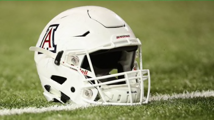
Even from an outsider’s perspective, the Arizona A logo is visually more appealing then just a pitchfork. For almost 30 years the Sun Devils football logo was Sparky holding a pitchfork. For whatever reason, they switched it up, who knows? The Wildcats football logo has changed over the decades, but it’s been more of a style change. Whether its been a change in colors or overall look, but nothing as drastic as completely removing the A and putting Wilbur the Wildcat as an example.
More from Arizona Wildcats
- CFB Promos: Bet $15 on Any Game, Win $400 in Bonus Bets!
- How Wildcats Fans Can Claim $200 INSTANT Bonus at BetMGM Betting $10 Right Now
- Last-Minute Game Information Arizona Football vs Mississippi State
- Arizona Football dominates NAU in their Season Opener
- Former Wildcat Nick Foles named an Honorary Captain
Now some reading this may disagree with this, but this list of Top 8 worst football logos was done from an outsider, keep that in mind. Other schools that made this list were Northwestern, Oregon State, Hawaii, Memphis, Mississippi St, Northern Illinois and Texas Tech. The Arizona Wildcats were not.
Like the football uniform, the Sun Devils basketball form has seen many changes over the decades. Their latest uniform has the pitchfork on the side of their shots. The Wildcats basketball uniform has seen many changes as well, but again similar to their basketball uniform it’s been more of an overall style change, nothing crazy like a complete change.
Their is nothing wrong with changing the uniform, if it makes sense and is appealing. In this case, going from Sparky holding a pitchfork, to just the pitchfork doesn’t do either. They could have taken Sparky, updated it and made it more modern looking. The changes though made to the Arizona A has made sense and has kept with the times .


Add to the heated rivalry between these two schools their logos. The logo represents what these programs are all about. The Wildcats and the Sun Devils do have a heated rivalry on and off the field, between players of all sports and fans. Those who have grown up in Tucson or have gone to University of Arizona know what I am talking about! There is nothing like attending these games in person to truly understand how much each school doesn’t like one another.
Not only does Arizona football lead the overall head to head matchup 49-42-1 over Arizona State, they have the edge when it comes to the logo. The Arizona A, simply put is the best logo in the state of Arizona! Bear Down, Arizona!