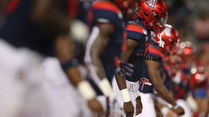
As the 2020 Arizona Football season draws near, we felt it’s time to discuss how our uniforms could use an upgrade, as well as look at some of our previous uniform atrocities.
If you’re like me, you are counting down the days until Arizona Football finally upgrades their uniforms yet again. Especially as this past season was nothing short of a tease, when the Wildcats wore their retro ‘Desert Swarm’ uniforms for homecoming.
For one brief moment, it gave us fans a glimmer of hope that Nike still has some good Designers out there, and that the ‘Football Uniform Gods’ if there is such a thing, don’t completely hate us.

Arizona Wildcats
However, as it was just for one game, it constantly reminds me that we just can’t be that lucky, and it’s really hard to get over the atrocities we’ve seen on the field dating back to the 2013 season.
No, I’m not talking about the on-field results, which have also been lackluster to say the least, but if you’re going to lose, at least lose in style.
It all started in 2013 when Arizona first introduced to the Gradient jersey’s, which were so aptly nicknamed, the “Rainbow Jersey’s”. It felt like we had those monstrosities for an eternity, and when they finally replaced them in 2017, things really didn’t get all that much better.
Instead of gradients, Arizona switched to some rather obnoxious looking sleeve stripes that look a bit too big and awkward. On top of that, the number font looks a bit ‘Pop Warner-ish’ and lack an outline color. The number is all one color, and on the darker jersey’s, those numbers can be rather difficult to make out, even if they happen to be huge numbers.
So many design ideas that didn’t really turn out so well, so hopefully when the Wildcats do finally upgrade their uniforms, they will stay away from these things…

No More Gradient, please!
Thankfully, we haven’t worn these in quite some time, but hopefully they, or some modified version of this will ever return.
To me, nothing says failed design like some cheesy gradient numbers/ sleeves that look as if they were ripped off from an Arena Football team. To me, the contrast on the uniform didn’t work, and from afar the numbers can be hard to see, especially on the blue uniforms if you can recall.
If anything, the sleeves looked more purple-ish than red-blue, and overall it was just a disaster. Hopefully, when Arizona Basketball upgrades their uniforms as well, Nike can fianlly put the gradients to rest once and for all.
So moving forward, please no gradients ever again!

No More Tomato Lids
I hope I am not alone in this, but I am not a big fan of these helmets. To me they look boring and they really don’t go with the rest of our uniforms.
The contrast looks awful and the overall color is a bit too dull and doesn’t really look scarlet at all, it looks more like the color of the Campbell’s Soup logo.
I’m okay with keeping the metallic red ones that we’ve introduced recently, but please leave these things out of our uniform rotation.

No More All White Lids
I know not everyone will agree here, but to me, nothings says Pop Warner helmet quite like an all-white helmet with a basic decal.
Look, I have no problem with wearing white helmets, but there at least needs to be another design element to it. Perhaps using the blue facemask, or bring back the helmet strips, but to me this look is too boring.
Arizona needs to get rid of the all white helmet look and when they do finally upgrade their look, hopefully this is something they will consider doing.

No More Gimmicks
Seems pretty straightforward, but please, no more over-sized sleeve stripes, no more copper helmets, no gradient sleeves/ numbers, just keep it simple.
To me, sometimes the best uniforms in college football are simplest. Minimal design, no Duck wings, no claw marks as stripes, etc. If you need help on visualizing what a good Arizona Football uniform would look like in my eyes, well look no further than this.
Maybe give those uniforms a slight update, and still keep another helmet or two in rotation for fun, but those mid-to-late 90s uniforms should be the template for us in the future. It’s a clean look, it’s retro, and most importantly, it doesn’t make us look so tacky.
So please, Arizona and Nike, please heed the advice from us fans and give us some respectable football uniforms again!
